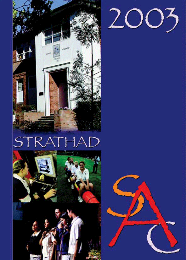
This school magazine is a very different design compared to the other two that I have looked at and deconstructed. The cover unlike the others has four main colours; blue,white,orange and red. This cover also has a number of pictures, not just one main one that takes up all of the background space. The photographs show the building and the student that got o this school. The school logo is in the bottom right-hand corner and is rather large. Perhaps to catch people’s eye and stick in their mind so that when they see it again they automatically recognise it. This is also designed simply, not too fussy, clean and approachable.

No comments:
Post a Comment