
Monday 29 April 2013
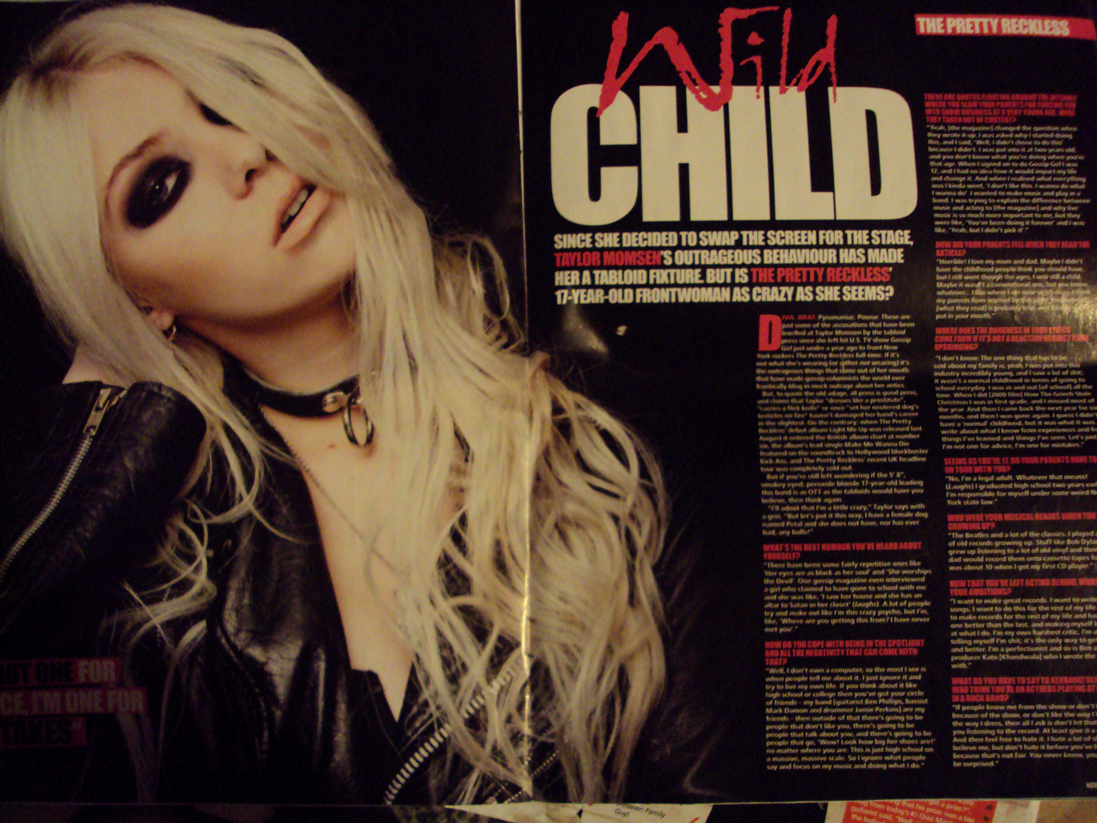
Final Double Page Spread
Final Contents Page

Final Front Cover

Sunday 28 April 2013
Questionnaire results
For my questionnaire I asked six people these questions and these were my results:
Do you buy music magazines?
Yes (3) No (3)
If yes, what type?
Pop (2) Rock (1) Classical Country R&B Other..
Why do you buy this?
Competitions Fashion Celebrities (1) Other..(2)
How often would you buy a magazine?
Daily Weekly (1) Fortnightly Monthly (2)
How much would you pay for a magazine?
£2.00 £2.50 £3.00 £3.50 (1) £4.00+ (2)


I am also keeping to a mid-shot for my model on the front cover too as from what I have seen, I prefer it to a close up shot.


Friday 26 April 2013
MOJO and NME double page spreads..

These are Double page spreads by NME magazine. Like my DPS here they use one main image as the background, but unlike my photo the they have the actual artists whereas i have the concert and the only image of my celebrity is on the front cover.

 Here are two images of MOJO's style DPS. This is very similar to mine, even though it shows the artist the image fills the background and the writing is on top of the image rather than in a text box which is what i've done. They are also taken at concerts.
Health and Safety
Health and Safety during the production of the magazine.
I took all of my photo's outside of the school grounds either at home or at the concert where i took my DPS photo. There was no health risks as my front cover photo was taken in the hallway of my house which is out of the way of other people, floor is even and nothing on the floor to trip my model or myself. I took the photos using my phone which created limited risk as i have used it many times. There wasn't much to take into consideration as there is nothing in the hallway as it's long and quite narrow with only a radiator which wasn't on at the time.
When i took the DPS photo i was seated and because of where i was seated i wasn't in the way of any other people so didn't risk anybody else's health.
Questionnaire
 Do you buy music magazines?
 Yes No
If yes, what type?
Pop Rock Classical Country R&B Other..
Why do you buy this?
Competitions Fashion Celebrities Other..
How often would you buy a magazine?
Daily Weekly Fortnightly Monthly
How much would you pay for a magazine?
£2.00 £2.50 £3.00 £3.50 £4.00+
This is going to be the questionnaire i am going to use to help complete my evaluation and finish off my magazine with.
I tried the background of the stage door and although it went with the theme of 'backstage' it was really dark. So i looked at CBGB's photo's and they are unique and staying with the theme of being behind the stage. Although it is not what i originally would have used, the colours are brighter and makes the page look more interesting. So i am thinking of this or another similar photo as my background as there are also iconic images that fit in with the grunge look.

Tuesday 23 April 2013

These are the two magazines that i have looked at and based my magazine on. The pictures i put up earlier of these two magazines showed close-ups of the celebrities. But, because i wanted to use a mid-shot rather than a close-up, i wanted to put up these two magazines again so that it would link in better.
Like these magazines also use white font which is what i'm going to do throughout my magazine. They are also very similar in the sense that they tend to keep to two colours on the front page and probably throughout the rest of the magazine, keeping to this simple design. It isn't overpowering either for the audience which would attract their attention, which is what i want to do.


Monday 15 April 2013


Tuesday 9 April 2013


Draft front cover

This is my draft of the front cover. In my final front cover i will add more sub-titles and pictures. I am going to use this same background as it is an edit of my sister and fits in with my theme and target audience.
Subscribe to:
Posts (Atom)