Friday 3 May 2013

Evaluation: How did you attract/address your audience?

How did you attract/address your audience?

I addressed my audience using this magazine being friendly and using eye contact. I used language that would imply the reader/audience but wasn't offensive. The person on the front of the magazine looks out at the audience and because i took the photo i hoped for it to represent the audience i am targeting and so it would become more appealing. To attract my audience i involve a competition on the front of my magazine. I use simple sentences as it gives the magazine a simpler, cleaner look which doesn't involve a lot of reading to put people off. I have also done a questionnaire of peoples points of view in what attracts them to a magazine which i took into account while producing mine.

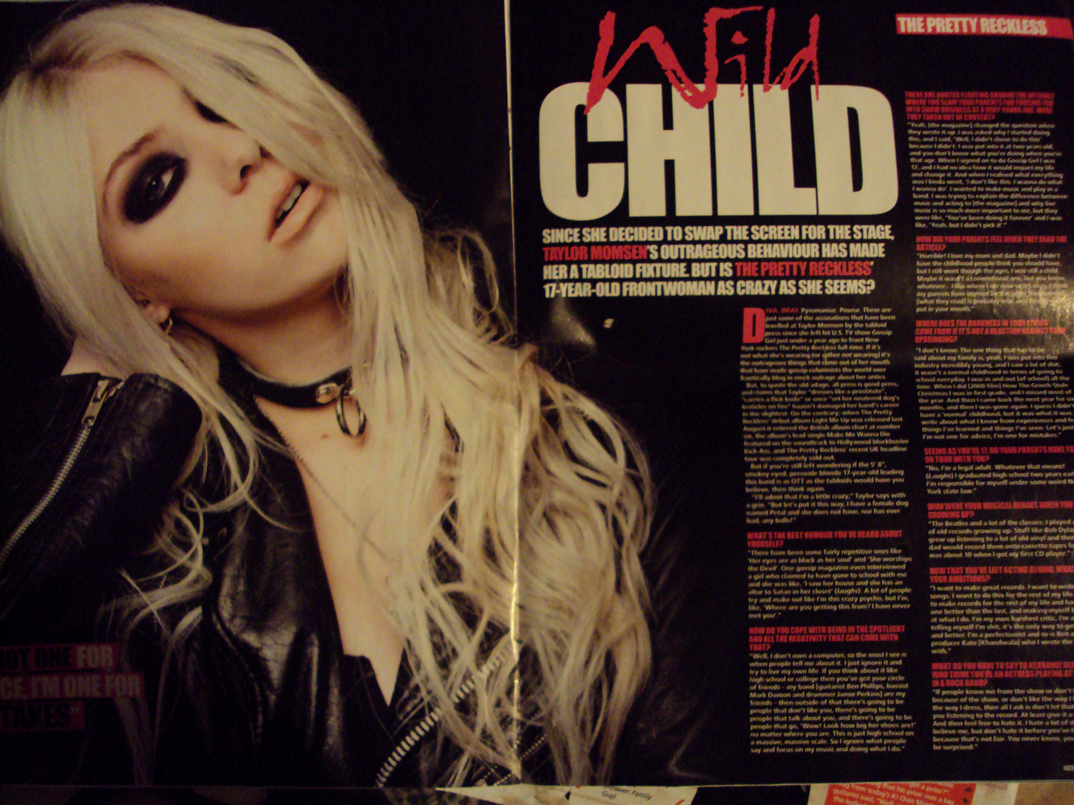
The person on the front cover is a mid-shot and is my 'celebrity' for the magazine and what the articles about. She is an example of my target audience in the way she dresses, wears her make-up and the fact she is striking a rock pose which goes with the post-grunge and alternative rock theme of the magazine. I think the person on the front cover is very important as the position and expression they are making represents how professional or unprofessional the magazine is and generally people who are looking to buy a magazine look at the front cover first and 'judge' it.

The colours i use within the magazine and on the front are simple as i keep to three:
Black
White
Red

These colours can be liked by both female and male. It goes with the magazines i have been looking at too. Also like the magazines i have been looking at, especially MOJO's front cover, i was inspired by the plain background and found it had a much more appealing appearance than a busy background. So i decided my magazine front cover was going to be white and plain. This helped me give off a simple, clean and uncomplicated look which i am pleased with. White is a light and airy colour too and i found i could use a lot of colours on this background too, so i didn't have to worry about not seeing some of the writing because the colours clashed.


Evaluation: What kind of media institution might distribute your media product and why?

What kind of media institution might distribute your media product and why?

My text is aimed at a niche audience as it is only a part of rock that would not interest everyone. I would choose a publisher that publishes my own kind of magazine. I would probably go with a publisher like EMAP because they publish a number of other similar magazines including MOJO one of the magazines i have been looking at. I think that they would distribute my magazine because it publishes very similar styled magazines and although my target audience isn't the biggest there are older  audiences that like this music and might find the magazine of interest.

The magazine would be able to be sold at supermarkets such as; Tesco, Morrisons, Sainsburys, WHSmith etc because although I think it a smaller audience compared to pop music over in the UK there are fans of the music and some of the bands that are in this category are well known. They also supply wide varieties of magazines to accommodate a wide audience especially young adults which my magazine is aimed at. Also because of the technology we have today, my magazine doesn't have to be sold in physical presence but could be sold over the Internet. For example; WHSmith. There is a number of music magazines sold online by this company which is quite well known in the UK so this would attract a big amount of customers with a lot of different interests. So my magazine could be of interest to WHSmith. Many people now have access to the Internet and it is a quick and easy way to purchase something. This would work to an advantage as i know that for people to buy my magazine, they don't have to be in a shop but at home or work on the Internet.


Thursday 2 May 2013

Evaluation: In what ways does your media product use, develop or challenge forms and conventions of real media products?

In what ways does your media product use, develop or challenge forms and conventions of real media products?

For this I am going to compare with MOJO's magazine.
My front cover compared to MOJO's magazine front cover very similar as the colours used are similar. The shots used for the MOJO magazines usually vary from close-up shots to mid-shots. I decided to use a mid-shot as with the photo that I have taken, it goes better than to have it zoomed in. It is also more to one side rather than the centre where most of the celebrities on MOJO's magazine are. But like the other magazine, I have decided to go with a clear background which gives it a cleaner look and the audience can concentrate more on the photograph and the writing. The font type I used is different as compared to MOJO that covers more the classical rock I wanted something to fit my theme more. The layout for my magazine I chose myself although writing 'Superstition' across the middle of the cover was triggered by MOJO's magazine. I think my magazine works quite well considering the software I used to change the image was new to me.


The DPS I made was based with one main picture as the background rather than a number of images. This MOJO double page is very similar to what I did. There was a main image and the writing was written over the top of the image rather than in a coloured text box. There are two main colours on here, so unlike mine I had three and they were similar colours to the front cover and contents page, just this time a different shade of red. I also added my own elements to my DPS like the facebook and twitter symbols. Also the amazon symbol which was linked in to the article, used as advertisement. The layout I used was my own idea as I thought it worked well with the image I had and didn't leave lots of empty space. I did find myself experimenting a lot with the size of the fonts and where things should go but I'm happy with the end result.


The contents page i wanted to stay simple with one main image at the top and then the page numbers down 3/4 of the page. I also found MOJO's contents design simple too but instead of putting a celebrity up as the main image i put up a picture that i took of part of a guitar to signify all the music, rather than just one. My contents is darker and consists of the three main colours running through the magazine. I think now that i have completed this task there may be things i would change and experiment with; how i could use the space differently and perhaps more effectively. Overall i am pleased with this. Although mine is less detailed i felt the contents had all it needed on it. MOJO magazine used very similar colours to me but i think my red stands out more and the colours are richer giving off a stronger influence.
 

Evaluation: Who would be the audience for your media product?

Who would be the audience for your media product?

My target audience is a niche audience. As there are many different types of music, post-grunge and alternative is only a small majority in this industry.

My age range is from 15-25. Although the magazine may interest older audiences i have made it to fit this catagory specifically and i have tried to aim the magazine at both genders so that it will appeal to more.

Although this is a music magazine and the audiences interest is obviously music, i have included festivals and competitions to win money and a holiday. From speaking to people that is one thing that attracts them to a magazine as it is a free thing to enter however unlikely the chances of winning are. I used my questionnaire and from what i have found out people like keeping up dated on celebrity gossip so thatwould be something to include in my magazine. As my magazine is aimed at 15-25 year olds i would assume they would be in education, in an apprentership and working part time or just starting a full time job. Either way i do not feel that my magazine would majorly effect their daily life as it is something to enjoy and read in their spare time It may effect their lifestyle but probably not their career. I would also include games to do in the magazine and advertisement for movies, games and music. This way the magazine attracts wider audiences from different social groups and the people within my target audience.

I think the ABC1 C2DE grouping system is outdated and that my magazine is for all 'classes'. A lot has changed for this to still be in use especially to be compared to, music taste as there is such a variety now and people are free to like what they want. The class system can still be used in other senses, such as; jobs, countries where there is a big difference in the rich and poor etc. Over here in the western culture, UK, buying a magazine once a month isn't much. And doing the questionnaire i made, people would most likely buy a magazine once a month.


Wednesday 1 May 2013

Evaluation: Looking back at your preliminary task, what do you feel you have learnt in the progression from it to the full product?

Looking back at your preliminary task, what do you feel you have learnt in the progression from it to the full product?

Compared to my prelim task to this final text, i feel that i have improved as i have learnt to use new programs to give my magazine a better look and opened me up so i am more knowledgable and open minded. When i produced my prelim task i used Microsoft Publisher and that was it. So i was limited to resources. Although it was different to making a music magazine i can see things now that i would change as there are more resources to use.

My final text i think is an improvement as instead of using text boxes to fill in with colour and words i could do it straight onto the image. I also think that since i have done a lot more research on other magazines that there were things i could possibly change but because the research i have done on magazines where music magazines there is a big difference to a school magazine, especially as the ones that i looked at were similar to the one i produced.

The front covers are very different. The prelim task (left) was only produced on Publisher and although i had looked at magazines now i can see things i would change. As a school magazine i think it would be good but i don't like the text boxes down the side as it's not very easy to read the white writing. I kept to the three colours and i think the space was used well with a mid-shot at the centre.
                                              

The music magazine is styled totally different, partly because the magazine designs are totally different but also because i had more software to use. I used pixlr and managed to cut out the background to white which made it easier for me when writing on it because all colours show up on white. Also when i research magazines i took into account that most of them had plain backgronds. I kept to the three main colours again to suit my magazine and the style of it. Everything is more in line and i even included a barcode to make it seem even more real.


The contents pages are similar as they both have black backgrounds but the layout is totally different. My prelim task contents page is much more busy with more images and has the twitter and facebook symbols on it to advertise the school. I think for my prelim contents page i should have researched more of the other school magazines contents pages.

My music magazine contents is a lot more simpler with one main image at the top. The three colour's have been continued throughout from the front cover. I edited the photo rather than just taking it and putting it up like i did with the prelim task. Editing the photo meant that i was learning more about the new software i was using (pixlr). I wanted this to be less busy as the music magazines i have looked at were styled less simpler and i found it more appealing, not overpowering.

Evaluation: How does your media product reoresent particular social groups?

How does your media product represent particular social groups?

My magazine i aimed at teenagers from 15 to young adults up to 25 years, eventhough the music in my magazine could interest older audiences. I was also aiming the magazine at both males and females who like alternative rock and post grunge music. So i would add advertisements and products on sale to accomodate both gender interests.

I chose to represent this audience positively,hopefully this has come across to the audience and the targeted group so is not offended as i used quite dark colours which could be argued as stereotyping in a rock magazine. The language is friendly and informative of the latest news. The model i used on the front listens to rock and fitted in with my target audience and she also fits into the age catagory. In my magazine she is a rising rock star so i think showing a female on the front of the magazine doesn't give the feeling of elimination of females as usually it is assumed rock magazines are for males because it is more masculine music.

It would represent  groups like this:


Not social groups such as this:


Evaluation: What have you learnt about technologies from the process of constructing this product?


What have you learnt about technologies from the process of constructing this product?

 
To take the photos that i have used for my magazine front cover, double page spread and contents page, i used the camera on my phone and uploaded them onto the school laptop and a Mac. I used three programs to make my magazine what it is. I also Google as my search engine.

Microsoft Publisher

I used microsoft because this way i could easily play about with the settings;size of the writing, fonts etc. I used Publisher for the layout and cropping pictures so that i could fill the page with what was most important. It was also used for it's range of fonts. Especially with the front cover and double page spread. The picture of the stage that i use for my double page i wanted to make bigger as there was too much black space that wasn't needed, especially at the top. I also cropped the front cover as i had it as a medium shot but the audience would mostly be looking at the models face and above the elbows rather than her stomach. I then made her a little bigger to take up more of the page.

Pixlr

Pixlr was a new program for me so i did a few practise edits, changing and adding layers to the original photo. I changed the saturates and contrast and played about with special effects. I also tried rubbing out the background and seeing what i could do with that. I chose to experiment on photos of bands that was withing my magazines theme, post grunge and alternative rock. Using Pixlr i also realised what did and didn't go, such as; colours, effects and brightness.

 
 Blogger

Before this coursework task i had never used Blogger. It has allowed me to share my work, look at others and to comment and share my opinions. Blogger was also what i used to create some of the pieces of work i have put up rather than using a microsoft document as it allowed me to paste pictures and write in different fonts etc. Although it allowed me to do this it is very limited and unlike publisher i can't place photo's exactly where i want them.


Google

Google was used majorly in the process of making my magazine. I got my practise photo's from google and the mood boards i produced included Google images. I also used this search engine when i was researching secondary sources for other magazines and fonts.


Monday 29 April 2013

Final Double Page Spread

*Final Double Page Spread* I am pleased with this. The photograph i took for the main background works well and the layout isn't too busy or empty either.

Final Contents Page

*Final Contents Page* I am quite pleased with this as i didn't want a fussy contents page but a clean, simple one. The colours from the front cover are carried out on this page too. I took into consideration what i found out from my questionnaire and used that information on this page,what is included in the magazine.

Final Front Cover

*Final Front Cover* I am pleased with the outcome of this piece. I have kept to three main colours which will run throughout the magazine. Hopefully it will appeal to the targeted audience as i have been inspired by other magazines, such as, MOJO and taken some of their design layouts and styles into account.

Sunday 28 April 2013

Questionnaire results

For my questionnaire I asked six people these questions and these were my results:

Do you buy music magazines?

Yes (3)     No (3)

If yes, what type?

Pop (2)      Rock (1)      Classical     Country      R&B      Other..

Why do you buy this?

Competitions      Fashion      Celebrities (1)      Other..(2)

How often would you buy a magazine?

Daily      Weekly (1)      Fortnightly      Monthly (2)

How much would you pay for a magazine?

£2.00      £2.50      £3.00      £3.50 (1)     £4.00+ (2)
Although I have looked at many different backgrounds for my front cover and considered doing an image on top of another image. I have decided to keep it plain and white as that is what I was originally going to do and gives a good professional look on these magazines by NME and MOJO. My main colours are still going to be red, black and white as they are the continuous colours going through the magazine.
I am also keeping to a mid-shot for my model on the front cover too as from what I have seen, I prefer it to a close up shot.


Friday 26 April 2013

MOJO and NME double page spreads..


These are Double page spreads by NME magazine. Like my DPS here they use one main image as the background, but unlike my photo the they have the actual artists whereas i have the concert and the only image of my celebrity is on the front cover.
  Here are two images of MOJO's style DPS. This is very similar to mine, even though it shows the artist the image fills the background and the writing is on top of the image rather than in a text box which is what i've done. They are also taken at concerts.

Health and Safety

Health and Safety during the production of the magazine.
I took all of my photo's outside of the school grounds either at home or at the concert where i took my DPS photo. There was no health risks as my front cover photo was taken in the hallway of my house which is out of the way of other people, floor is even and nothing on the floor to trip my model or myself. I took the photos using my phone which created limited risk as i have used it many times. There wasn't much to take into consideration as there is nothing in the hallway as it's long and quite narrow with only a radiator which wasn't on at the time.
When i took the DPS photo i was seated and because of where i was seated i wasn't in the way of any other people so didn't risk anybody else's health.

Questionnaire


Do you buy music magazines?

Yes      No

If yes, what type?

Pop      Rock      Classical     Country      R&B      Other..

Why do you buy this?

Competitions      Fashion      Celebrities      Other..

How often would you buy a magazine?

Daily      Weekly      Fortnightly      Monthly

How much would you pay for a magazine?

£2.00      £2.50      £3.00      £3.50      £4.00+

This is going to be the questionnaire i am going to use to help complete my evaluation and finish off my magazine with.


I tried the background of the stage door and although it went with the theme of 'backstage' it was really dark. So i looked at CBGB's photo's and they are unique and staying with the theme of being behind the stage. Although it is not what i originally would have used, the colours are brighter and makes the page look more interesting. So i am thinking of this or another similar photo as my background as there are also iconic images that fit in with the grunge look.

Tuesday 23 April 2013


These are the two magazines that i have looked at and based my magazine on. The pictures i put up earlier of these two magazines showed close-ups of the celebrities. But, because i wanted to use a mid-shot rather than a close-up, i wanted to put up these two magazines again so that it would link in better.
 Like these magazines also use white font which is what i'm going to do throughout my magazine. They are also very similar in the sense that they tend to keep to two colours on the front page and probably throughout the rest of the magazine, keeping to this simple design. It isn't overpowering either for the audience which would attract their attention, which is what i want to do.


This is the background i have thought about using for my final front cover back ground and then prop my sister on top. It would link in well with the article on my double page spread.

Monday 15 April 2013

This is my draft contents page. I decided to keep it simple as most of the magazine is set out that way. I've tried to keep it to three colours as gives it a clean look. for the final version i will have taken the photograph taken at the top of the guitar i have at home.
This is my double-page spread draft. In the final version there will be more added to the page such as an image of the band which will be found off of the internet and edited. I chose this font for the title because it is post-grunge which goes with the theme of the magazine as it is covering post-grunge and alternative rock. I chose to put the image as the background also, because it is a picture i took myself and it is of the concert the article is about. It also goes well and i think it links in with the magazines i have looked at in style.

Tuesday 9 April 2013

These 2 photographs are primary research. Either one of these will be used as the background for the double page spread, the text will be in white relating to the concert.

Draft front cover

This is my draft of the front cover. In my final front cover i will add more sub-titles and pictures. I am going to use this same background as it is an edit of my sister and fits in with my theme and target audience.

Wednesday 27 March 2013

1st Draft for my front cover

This is my 1st draft. I edited this image so that the contrast was darker but the colours more vibrant. I thought it brought more power to the image. I'm still experimenting with the title font.

Monday 25 March 2013

Photo edits

More edits. This is a band called 'Art of Dying' that are in the post-grunge and alternative rock category.
 
This is the edit....


...and this was the original image..
This girl in the picture is 15 and looks like what my target audience should be like. Ideally i am aiming to design a magazine for 15-25 year olds so she just fits in this catagory. She wears dark clothes with skinny jeans. I feel this suites the music style i am  basing my magazine around as i have researched the genre styles. As i would also like this magazine to be aimed at males too she is not a 'girly girl' so would not put a male buyer off if i were to use her on the front cover of my magazine.
 

Friday 15 March 2013

Photo Editing

This is the original image of the band Daughtry. This lesson has really helped in my editing techniques so i experimented with this image. It has given me some ideas for the front cover of my music magazine.
This is the edited image!

Wednesday 6 March 2013

Why are these magazines called what they are?


MOJO- Has many different meanings from magic spells to charm and personal magnetism. This could suggest that the name of this magazine was chosen as the music genre magnetises the audience into the magazine as find it appealing.


NME- Stands for New Musical Express. Was created by Theodore Smythson and has been published every week since 1952. Started as a newspaper but moved in to a magazine format during the 1980s.